The beginning to the end - A Portfolio

The media product I will be creating is a magazine for Cambridge AS Level Media Studies requirement.

  • Home
  • Preliminary Work
  • Research and Planning
  • Coursework Development
  • Creative Critical Reflection
    • Question 1
    • Question 2
    • Question 3
    • Question 4
Typography is a fundamental design element in any magazine, it's creativity, enhances  reader experience.
The right fonts set the tone and choosing typefaces that align with the magazine’s aesthetic is essential to making the content visually appealing while maintaining a clear and structured layout.

I researched few magazine covers on internet and given below are the examples of those:

Everything home Magazine
On the cover, the words mainly appear to use a mix of on Serif or Slab-Serif Fonts.
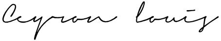
The heading appear as Script style.


https://www.presspadapp.com/blog/wp-content/uploads/typefaces.png


Beyond font choice, color and texture play an important role in typography. Soft, warm pastel shades or earthy tones work well in DIY craft magazines, reflecting natural materials like paper, fabric, and wood. 

Textured or watercolor-style lettering can add the handmade feel. Additionally, using bold, uppercase letters for section headings and playful, italicized script for subheadings can create a well-balanced composition.


Example of fonts styles Pic credit Universal shop AU

Craft magazines use a variety of fonts to create a warm, inviting, and creative feel. Handwritten fonts like Pacifico and Amatic SC add a handmade, personal touch, making the content feel more relatable. Slab serifs such as Rockwell and Museo Slab provide a bold yet friendly look, often used for titles to make them stand out.


What I learned
The fonts in craft magazines are more playful, casual, and friendly compared to the luxury-focused fonts of fashion magazines.


https://static1.squarespace.com/static/55881bf1e4b0e8531ecdd7da/t/55fac734e4b07b786fcb2291/1442498358718/?format=1500w


Deciding on the title is a very important part of the creation of the product.
Magazine titles play an important role in the overall magazine because they can influence the audience's impression. So it has to be catchy and relevant. My magazine should stand out from others in the same topic. The title can signal to the intended audience what kind of content they can expect to find within the magazine. So here are the few suggestions listed for my DIY craft magazine:

Reimagine
The word "Reimagine" encourages readers to see everyday objects transforming the ordinary into something extraordinary. This title not only speaks to eco-conscious makers but also appeals to anyone who loves hands on projects that mixed with creativity with sustainability.

Craftopia
The name combines “Craft” symbolizing handmade artistry and innovation with “Utopia”, representing a perfect space where creativity knows no bounds. Craftopia invites readers into a imaginative world where they can explore unique DIY projects, upcycling ideas.

EcoCraft
The word highlights the importance of using sustainable, recycled, and upcycled materials, encouraging readers to craft with a green mindset.

Conclusion and the Magazine title
Finally I decided to name my magazine "Crafted" and the name suggests something thoughtfully made with skill and care. It also appeals to both beginners and experienced crafters.
It suggests quality, intention, and artistry all of which align with the values I want to communicate through the magazine.
For my content page inspiration, I hopped on Pinterest to see to what I could find. These are some of the ones I came across that piqued my interest. 


This first one has a geometric design with a yellow color accent. This geometric design allows to have multiple pictures with being able to display them in a seamless way. The pop of color enhances the layout as well. The corresponding page number complimenting with the accent colors are a nice touch to go along the yellow theme. 

This one grabbed my attention because of the minimalistic design. There is barely any space taken but all the important elements are still there. Compared to the last pages, this one has less pictures and more text but the text is highlighted in a crisp way so that the eye is directed there first.


This layout also caught my interest, because it uses a mixture of various techniques to make it different. The bigger pictures with the big page numbers directs the reader to that area of the page first. This inconstancy of different sizes and colors compliment well with the whole layout.

Conclusion
Through this research, I was able to explore and get a good idea of magazine content pages should look. I observed how professional magazines organize their content using clean layouts, consistent typography, and strategic use of images to guide the reader. This helped me understand the importance of spacing, and balance when presenting information. Now, I have a solid idea of how to design my own content pages in a way that is both visually appealing and easy to navigate.
I know there's still room for improvement. My plan is to experiment with different layout variations,  and incorporate visual elements to enhance the overall user experience.
Now I’m going to let my imagination do the rest of the work to create the first draft!

Creating a successful DIY craft magazine requires more than just engaging content and beautiful visuals, it must connect with the right audience. Understanding who the readers are, what inspires them, and how they interact with craft related content is essential when designing my magazine.I gathered valuable insights about reader preferences, behavior, and demographics by conducting questionnaires and surveys.


Via Facebook

Questionnaires using Typeform
Platforms like Google Forms, SurveyMonkey, and Typeform allow magazine creators to collect direct feedback from potential readers.
I used Typeform because it's can very easily accessible with Mobile phones and desktops. I sent this survey link to my friends and various craft groups that I know.
Screenshot of typeform questionnaire is given below:

The link to the questionnaires:
https://form.typeform.com/to/NGB2sVVV

Then created a poll on WhatsApp group
This to decide on the name of the title that I should be using and used media like Facebook, Printerest to contact directly engaged with my craft related groups.


Sending Surveys via Facebook


Analyzing the results


After analyzing my survey results, I discovered that the majority of my audience falls within the 35–50 age group, with many being professionals.
Their interest in DIY crafts leans towards upcycling and recycling projects, favoring creativity with a practical touch.
They appreciate both printed and digital magazines, valuing the convenience of digital access.
They prefer less complex projects that are enjoyable and easy to incorporate into their busy lifestyles.

Online Community Research
DIY enthusiasts often participate in online forums and groups such as Reddit (r/crafts), Facebook Groups.
Here what I found out
I observed their discussions in these spaces and obtained valuable insights into current crafting trends. I learned what type of crafts they usually prefer in these part of Asian region.

Few screenshots are given below as a proof:


Responses for above post


Another craft post

via Facebook


Trend Analysis Tools

Platforms like Google Trends and Pinterest Trends help identify rising interests in the DIY crafting space, ensuring the magazine stays relevant with emerging ideas and styles.


Conclusion
Based on the survey and an analysis of various social media groups and trend analysis tools, my target audience for the DIY craft magazine consists primarily of individuals aged 35 and older. Most are professionals, with some preferring simpler crafts, while others are interested in more complex projects.
Most of the community is keen about the zero-waste mission and enjoys creating upcycled products.
This information will help me tailor the content and design of the magazine to better meet the needs of my audience.


After analyzing various contents pages of magazines(from internet and printed media), I came across three different magazines, that I gained valuable insights into various design approaches that could inspire my own layout.

Each of these contents pages had its own distinct structure, providing a rich source of ideas for my magazine.

The first contents page captured my attention with its sophisticated yet inviting design. The use of soft, neutral colors created a warm feel, while the combination of serif and sans-serif fonts added beautifully. The images were thoughtfully placed, along with text without much cluttering the page. I particularly liked how the page balanced structure and creativity.


https://issuu.com/everythinghomemagazine/docs/june2016

The second contents page, in contrast, had a strikingly minimalist design. It used only a small portion of the page for the table of contents, leaving potion of the page a crisp and clean look. The choice of fonts are  paired with a limited number of photographs. I particularly liked the big number style. While this design differed from the first in terms of layout, the typography remained a key element in elevating the overall design.

https://issuu.com/everythinghomemagazine/docs/june2016

The third contents page was the most visually striking. The use of bold typography and large, high-quality images made the page highly engaging. I was particularly drawn to this layout, where text and images interact each other. The balance between text alignment and creative design elements made the page more informative. 


What I have learned
Through this research, I was able to explore different approaches to contents page design, each offering unique ways to engage readers. These layouts provided a strong foundation for developing my own contents page.
To improve further, I can visit local bookshops and obtain printed copies of Sri Lankan magazines to see how their content pages are lined up. Analyzing these local designs will provide valuable insights into local design preferences, formatting styles, and how different magazines cater to my  target audiences.

For this part of my research, I began by analyzing the cover designs of three magazines from different genres: Spin Off, World Travel, and Vogue. This exercise is essential for me to understand the different design elements used in various types of magazines, such as typography, imagery, layout, and overall aesthetic.

Spin off

Spin off is magazine the art and the craft of making yarn. This magazine also explores other crafts that involves around yarn. like crocheting and knitting. This magazine can be targeted at anyone who is interested in learning about knitting or about yarn.


(The magazine is taken by Pinterest and the annotations are done by me)

The masthead is placed at the top with a large font with two straplines both top and bottom. The dateline is perfectly aligned under the letter “S” seamlessly blend with the layout.

Another main magazine element shown here is the puff. It is in the color blue with the font being white perfectly contrasting colors of the magazine. This instantly grabs the reader’s attention also because the magazine offers a freebie. This is why a puff can benefit so much in magazines like this because it instantly grabs the reader’s attention.

The main cover line is written in three front each with different colors all that contrasts with the rest of the magazine.

World Travel

(The magazine is taken by Pinterest and the annotations are done by me)


World Travel is a luxury travel and lifestyle magazine that is aimed towards anyone looking for a good travel destination and tourists in general.

This magazine has the least number of elements as possible due to keeping that luxury aesthetic. Compared to the last magazine cover, this one only relies on one main cover line and the scenery photograph.

To fit the both World and Travel they have made World appear vertically on the top left side of the magazine. This not only keeps the minimalistic vibe but also makes the word Travel stand out.

Vogue

Vogue, also known as American Vogue, is a monthly magazine that covers news including fashion, beauty, culture and lifestyle. Vogue has a predominantly female readership and it’s best suited for advertises targeting fashion and beauty enthusiasts.


When analyzing the magazine cover, I first see the cover model and masthead at the top in big bold letters. At present day the masthead font is the modified version of the classic "Didot" typeface. There certain variants in some issues but it has mostly stayed consistent.

As for the cover lines they have used variants of sands-serif fonts throughout the cover.

For the cover subject they have used recent celebrities where unlike in the past they used fashion models like Kate Moss. Nowadays people tend to recognize famous singers and actors/ actresses which means this could increase the likely hood of purchasing the magazine.

Learning outcome:
By analyzing and researching these magazine front covers I was able to get a better understanding of topography, photography and representation of a magazine. Now I can visualize how my magazine front cover would look like.
Studying how different magazines use fonts, imagery, and layout to convey their theme and attract readers has helped me develop a clearer vision for my own cover design.
Ever since I was little girl, I always had my hands fiddling with some kind of brush or crayon most of the time creating absolute chaos. Sometimes the messes I would with my kid friendly paint would send my mother in to a temporally coma. As I grew older and older those little habits turned into an artistic spark.

Inspiration
My father has been a passionate model train railroader, and from childhood, I watched him create intricate miniature toys and houses in various scales. Spending countless hours observing his craftsmanship sparked my fascination with detailed, hands-on projects.
Over time, I was drawn to watching YouTube videos of people creating different crafts, which further fueled my creativity. Inspired by both my father’s work and these videos, I began experimenting with making crafts at home in my leisure time.


Image credit via Google images

As time went on, I got busy with various school work and other responsibilities. This led me to have little to no time take time to myself to do things that. But I wanted to keep my creative juices flowing so I explored countless arts n’ crafts content. Content such as how to make DIY crafts, painting on wood etc.

Image credit via Google images

Then I came to AS level and choose media studies. At first I didn’t know what genre of magazine I would choose. Then after procrastinating for a bit I asked myself, “what if I created a magazine involving some form of art?”. Then after doing some research I found out there are quite a lot of craft magazine types which I formed some interest to.
 
Planning
So in the end I decided to do a magazine that focuses on crafts that which are made from eco friendly things like jewelry and bags.


Learning outcome:

Working on this project has helped me gain a clearer understanding of the key elements I need to focus on. It made me realize the level of planning and effort required for each segment of the magazine, such as organizing photo shoots, editing images, designing layouts, writing content, and coordinating the overall visual flow.

Through this process, I also became more aware of how important it is to manage time effectively and maintain consistency in style and tone throughout the magazine. It’s not just about showcasing beautiful crafts, but also about telling a story that highlights the value of eco-conscious living and handmade artistry.

 If I don’t have access to natural light or the budget for professional lighting gear, a DIY photography lightbox can be a practical and affordable alternative. Also known as a light tent, a lightbox is an enclosed space designed to evenly diffuse light around smaller objects, eliminating harsh shadows and glare. It helps produce clean, well-lit images that highlight the details of the product.

My initial budget included to buy a light box, but I dismissed that idea and made my own box.

Here are the steps and necessary items:

A cardboard box
My box will house the white background for my photos. I used the biggest box that I can find as it allows me to photograph objects of different sizes.

Take the cardboard box and remove one of its sides completely usually one of the sides that opens. That’s the opening where we shoot into the lightbox.

White paper
I lined the inside of the box to create the white background. White poster board is good over paper, as it won’t crease when placed within the box. The white background will make the object appear as if it’s sitting in an empty space, which is great for product shots.

Clear tape and Scissors
Place the paper over the top of the box and I used scissors to cut away the excess edges. The paper should be the width of the box and about twice as long on the top side, so it covers the entire interior without creases. Tape to hold everything together without being too messy.

Lamps
I have put up LED light as a light source to diffuse within the box to get that consistent lighting.

So I made my Own DIY light box using items which are available at my home.


Here are the sample Photos:


What I have learned
Making a DIY lightbox at home is a fun and it provided me a valuable hands on experience in understanding how lighting affects product photography. The key learning outcomes include gaining practical knowledge about light diffusion, shadow control, and how to create a clean, consistent backdrop for small objects.
However, there are areas for improvement, such as achieving perfectly even lighting, maintaining color accuracy, and managing reflections especially when working with glossy or metallic objects. Post-processing tools like Adobe Lightroom can help overcome these challenges by allowing  to fine-tune exposure, adjust white balance and enhance colors.
Before starting the research and planning process for my magazine, I know I need to create annotations for screenshots, draw freehand for draft pages, and develop storyboards. To do this, I’ve decided to use my Huion tablet along with Clip Studio Paint, a software I’m quite comfortable with.

As part of my freehand practice, I designed a logo using the Huion and Clip Studio Paint. I might even use this logo for the magazine.


Learning Outcome: I gained confidence in using the Huion tablet and Clip Studio Paint for creative tasks like freehand drawing and logo design. The practice helped me improve my skills in drawing and additionally, practicing more complex storyboarding and annotations will help me work more efficiently in future projects.


Newer Posts Older Posts Home

ABOUT ME

Hi, I'm Sehansa Jayasuriya and I'm a student at Ladies' College , Sri Lanka studying Cambridge media for my A-Levels. This is my journey of learning the ropes of media all presented through this blog.

POPULAR POSTS

Categories

  • Coursework Development 18
  • Creative Critical Reflection 4
  • Preliminary Work 10
  • Research and Planning 22

Contact Form

Name

Email *

Message *

Blog Archive

  • April (4)
  • March (5)
  • February (8)
  • January (5)
  • December (1)
  • November (10)
  • October (4)
  • September (9)
  • August (4)

Oddthemes

Copyright © The beginning to the end - A Portfolio. Designed by OddThemes